Thursday, December 23, 2010
Audacity Mixing Project
For my mixing project my subject was fear. The songs I used were Wake Up Dead by Megadeth, and Master Of Puppets by Metallica. I started off with master of puppets opening and tthe second part was a spider chord riff from Megadeth. Than Master Of Puppets again, than another sipder Chord riff. Than I put in a breakdown from Master Of Puppets, than a build-up from Megadeth than a build-up from Master Of Puppets than finally the ending of Wake Up Dead. This whole process took me 6 days and it came out to 3 minutes and 15 seconds.
Thursday, December 2, 2010
Rollover Images 4
Wednesday, December 1, 2010
Rollover Button
Friday, November 19, 2010
ILLUSTRATOR_ Home Page
ILLUSTRATOR_Class overview
ILLUSTRAOTR_Projects
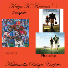
 This is the projects thing. It's a picture of an example of illustrator and photoshop. In the illustrator picture the picture has been modified to make it a little mashed up but still good. The photoshop image is a DVD cover made into a different cover from ESPN. The orignal was a DVD movie called the Blindside. It was changed to the Darkside, with Peyton Manning instead of Michael Oher.
Tuesday, November 9, 2010
 This a photoshop image of me and Katy Perry at the beach while the sun is going down. This was very confusing for me. I had to make the image of Katy perry and myself seprately. Then after days of trying to put these together I simply took the Katy Perry image and slapped it on the sunset. I erased Katie's original background and there we go.
Tuesday, November 2, 2010
Photoshop Tennis_Panther
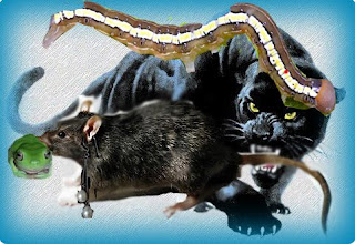
 Once again there are two add ons. Joyce did her final add on by putting a frog in the rat's mouth. Than for the final add on by me, I just simply putt an earring in the rats left ear, just to give some type of fancy look. The final pic is a panther eating a rat, while the rat is eating a frog with an earring on, but the caterpillar is eating the panther so pretty much the caterpillar is eating everyone.
Tuesday, October 26, 2010
Layer Mask
Combination
Feathered Edges
Magnetic Lasso
Tuesday, October 19, 2010
Wednesday, October 13, 2010
Flyer
My flyer is about a concert that a band is putting on. To start out with the flyer I drew a red rectangle to cover the page. Than I went online and picked up a Flying V Guitar. I kind of cheated I drew lines next to the guitar and chose draw on a path. I didn’t use any other shapes besides rectangle. But I gave a good description for the directions, what will be playing, and how much to get into the café’.
I used the element of line a lot. I drew lines so I could write the text next to the guitar. There are also a lot of lines on the guitar, the strings, the fret line separation, and the lines of the rectangle in the background. There is some shape in this, the rectangle, the border of the guitar created another rectangle, the guitar has some shape to it.
Tuesday, September 28, 2010
ILLUSTRATOR clipping mask Name on a pathway
ILLUSTRATOR Clipping mask name
ILLUSTRATOR Clipping Mask
Monday, September 27, 2010
Welcome
Hi! My name is Kevyn Bretonesand I will be using this blog as a portfolio for my Multimedia Design class. I will be posting my projects and examples along with a brief description of what I did. Please check back to see my work!
Subscribe to:
Comments (Atom)


 To create these rollover buttons I went to adobe Illustrator. I first made an oval, i colored it, than entered text and worte HOME. It was that easy, and to make it easier I just changed the color of the oval to make my second oval.


